If you’re looking to make a career change you probably already know that having a sharp and up-to-date resume is critical, but it’s important to remember that it’s not just the content on the page that’s being checked out by hiring managers.
According to research conducted by TheLadders, recruiters spend an average of “six seconds before they make the initial ‘fit or no fit’ decision” on candidates. A resume is often your first opportunity to make an impression on a recruiter, and if you only have six make or break seconds, you have to have all the details just right. That means picking the right font.
As small of a detail as this might seem, the typeface you choose to present to your would-be employer can say a lot about you. Courtesy of Natalie Kitroeff at Bloomberg.com comes the article “The Best and Worst Fonts to Use on Your Resume.”
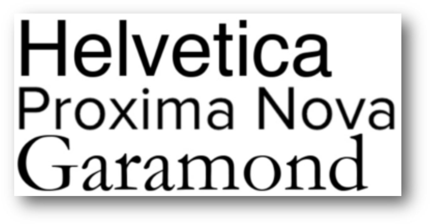
 While there are definitely some safe bets (like the three to the left), the exact font that you choose should depend on what you’re trying to get across. Do you want to show your soft side? “Proxima Nova” is a solid choice. Going for a more upscale look? “Didot” might be a great option for you. Want recruiters to avoid you like the plague? “Comic Sans” definitely fits the bill.
Take a few minutes to check out the full article for the do’s and don’ts in font selection, and whatever you do, keep resisting that urge to use that new emoji you just discovered. It looks much less adorable on your resume, we promise.
Think you’ve discovered the be-all and end-all of resume fonts? Let us know about it in the comments section below!

I am so glad to have a chance to read your wonderful article. I am looking forward to read more of your works and posts.